
Root Cause Analysis with Fishbone Diagram Example, Pareto, and Control Charts
This statistics assignment sample works through three quality management tools on real data: a fishbone diagram that traces the causes of exam failure, a Pareto chart that ranks seven causes of poor mobile quality, and a control chart that tests whether a defect process is stable. Each tool is explained, drawn and interpreted.

This is a quality management statistics assignment, worked in two parts. It uses three of the seven classic quality tools on real data: a fishbone diagram that traces the causes of failing an exam, a Pareto diagram that ranks seven causes of poor mobile quality, and a control chart that tests whether a minor-defect process is stable. It was written for an undergraduate business statistics module, and each tool is drawn, interpreted and then criticised.
If you have a similar brief, our statistics assignment help covers quality tools, distributions and hypothesis testing, and our MBA assignment help covers operations and quality management reports. More samples sit in business assignments. For an engineering calculation rather than a quality tool, see our shear force and bending moment diagram worked example. Nursing briefs use quality tools too: our medication errors quality improvement project plans three PDSA cycles on an acute medical ward and tracks them on a run chart.
Root Cause Analysis with a Fishbone Diagram
The Assignment Question
Analyse quality management issues using the Fishbone Diagram, Pareto Diagram, and Control Chart. Identify root causes, prioritise critical problems, and evaluate process stability through statistical tools. Provide recommendations to address identified challenges and improve overall quality.
Part 1 covers the fishbone and Pareto diagrams. Part 2 covers the control chart and its limitations.
What Is a Fishbone Diagram and How Do You Draw One?
A fishbone diagram, also called a cause-and-effect or Ishikawa diagram, breaks one problem into the categories of cause that feed it. The effect goes at the head of a horizontal arrow; each bone carries a category, and the specific causes hang off it. It is one of the seven basic quality tools and is used to reach a root cause rather than a symptom.
Fishbone diagram: failing an exam
-
Students
- No specific goals set
- Less preparation
- Weak understanding
-
Teachers
- Low amount of salary
- Old teaching
- Ignorance of underperforming students
-
Resources
- Under-par lab facility
- No internet connection
- Inadequacy of books
-
Mental ability
- No practical experience
- No trainings
- High stress
-
Socio-economic factors
- Low salary
- Corruption
- Low job opportunity
-
Learning environment
- Below par classroom facilities
- Less competition
- Attraction towards high paying jobs
Effect Failing an exam
The reason it is drawn rather than listed is that the drawing forces the grouping. A list of fifteen causes invites you to fix the first one; a diagram with six branches shows that three of them concern people, two concern resources and one concerns the environment, which is a different conversation. It is a brainstorming tool, so what it produces is a set of hypotheses to test, not findings.
How to Draw a Fishbone Diagram, Step by Step
The diagram above is this sample’s own, redrawn: six categories and eighteen causes behind the effect ‘failing an exam’. These are the steps that produced it.
How to draw a fishbone diagram, in four steps
- State the effect Agree on one problem statement before anything else. Here it is failing an exam.
- Draw the spine A horizontal arrow pointing right, with the effect written in a box at its head.
- Add a bone for each category of cause Ishikawa's generic six Ms (materials, machinery, methods, measurement, manpower, mother nature) suit a production line. This sample names its own six: students, teachers, resources, mental ability, socio-economic factors and learning environment.
- Hang the causes on their bones Under each category, ask why the effect happens and attach every answer to that bone. A cause can sit under more than one category.
Two limitations belong in the write-up. The first is that a brainstorm produces irrelevant causes alongside relevant ones, and the diagram records all of them with equal weight, so every branch is an opinion until it is checked against data. The second is readability: past roughly six categories with three causes each, the diagram stops being something a reader can take in at a glance, which was the only reason to draw it. Both point to the same next step, which is to count how often each cause actually occurs. That is what the Pareto diagram below does.
What Does a Pareto Diagram Show?
A Pareto diagram ranks causes by how often they occur, with a cumulative percentage line across the top, so the few causes worth fixing first are visible at a glance. It tests the 80/20 rule. In this sample, two of seven causes account for about 77% of poor mobile quality reports.
Causes of poor mobile quality, by number of occurrences
Chart data
| Item | Value |
|---|---|
| Poor design | 80 |
| Wrong part dimensions | 16 |
| Defective parts | 12 |
| Machine calibrations | 7 |
| Operator errors | 4 |
| Defective material | 3 |
| Surface abrasions | 3 |
Below is a Pareto diagram from the given data:
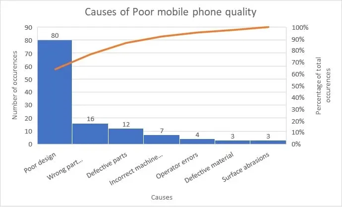
The 80/20 rule, also called the Pareto principle, says that for many events roughly 80% of the effects come from 20% of the causes. It is named after Vilfredo Pareto, who showed that about 80% of the land in Italy was owned by 20% of the population (Clinical Excellence Commission, n.d.).
In this data, two of the seven causes (29%) account for 96 of the 125 reports (77%). That is close to 80/20, and close is all the rule claims: it describes a rough pattern, not a ratio the data ought to reach, so there is no gap to explain. What the chart settles is the order of work. Poor design alone accounts for 80 reports (64%), more than the other six causes put together.
How Do You Read a Control Chart?
Plot each observation against a centre line and upper and lower control limits. A process is stable when most points cluster near the average, few approach the limits and none crosses them, and no run of seven consecutive points sits on one side. The minor-defect chart below passes all three checks.
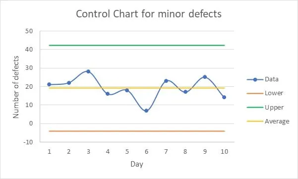
The chart plots ten daily counts of minor defects against an average of about 19, an upper limit of about 42 and a lower limit of about −4. The highest count, about 28 on day 3, and the lowest, about 7 on day 6, both sit well inside the limits. The run test, sometimes called the rule of seven, is passed with room to spare. The longest run on one side of the average is three days (days 1 to 3 above it, days 4 to 6 below), and no more than three points in a row rise or fall. So the variation here is common cause rather than special cause, and chasing individual days would waste time: to reduce the defect rate, the process itself has to change.
What Are the Limitations of Control Charts?
Four limitations matter in an assignment. The chart assumes a normal distribution and independent measurements, and it fails quietly when either does not hold. It needs staff trained in the mean and the standard deviation. Control limits set too close to or too far from the mean distort the picture it gives. And a stable process is not the same as a capable one.
Control charts are used across manufacturing and service industries, but they carry four limitations an assignment should state rather than assume away.
- The assumptions are strong. Limits are normally drawn three standard deviations either side of the centre line. For a normally distributed characteristic those three-sigma limits are the practical equivalent of 0.001 probability limits, so a point outside them is genuinely unusual; but where the underlying distribution is skewed, the NIST/SEMATECH handbook notes that the risk of hunting for an assignable cause when none exists is greater than one in a thousand on one side and smaller on the other (NIST/SEMATECH, 6.3.1). The chart also assumes successive measurements are independent, which defect data collected shift by shift often is not. The failure is quiet, which is the problem: the chart still draws, and it still looks authoritative.
- It needs trained staff. The mathematics is only the mean and the standard deviation, but somebody has to choose the sample size, set the limits and interpret a run of points. An organisation with no quality-assurance experience will draw the chart and then misread it, which is worse than not drawing it at all.
- The limits can be wrong. Limits set too close to the mean produce false alarms until staff stop trusting the chart; limits set too wide let a drifting process pass as stable. Because the limits are calculated from the same data they then judge, a spell of unstable production quietly widens them.
- Stability is not capability. This is the limitation that matters most for the chart above. Control limits come from the process itself; specification limits come from the customer. Process capability is the comparison of the two, and a capable process is one where almost all measurements fall inside the specification limits (NIST/SEMATECH, 6.1.6). So a process can sit inside its control limits, be perfectly predictable, and still miss the specification on every unit. A control chart has to be read alongside a capability index and the specification itself.
Stratification is the usual answer to the first and third points: split the data by shift, machine or operator before charting it, so that a mixed population does not average out into a line that looks stable. It costs more data collection, which is why it is the step most often skipped.
Recommendations from the Three Tools
The brief ends by asking for recommendations, and a marker will look for the section that gives them. Each tool supports a different one.
- Failing an exam: count the causes before choosing one. The fishbone lists eighteen possible causes and gives none of them a weight. Tally which ones apply to the students who actually failed, through an audit of their records or a short survey, or have the teaching staff vote on the causes after the brainstorm, then draw a Pareto chart of the result (Clinical Excellence Commission, n.d.). The recommendation goes to whichever causes lead that chart. If the exam is your own, the Students branch, less preparation and weak understanding, is the part you control, and our four-week revision plan for university exams sets out what to do week by week.
- Poor mobile quality: start with the design. Poor design alone is 80 of the 125 reports (64%), and wrong part dimensions take the pair to 77%, so a design review that also checks part dimensions comes first. Cheaper fixes further down the chart need not wait for it. If retraining operators costs little, it can run alongside, because easy fixes among the ‘trivial many’ may be acted on early (Clinical Excellence Commission, n.d.).
- Minor defects: change the process, then redraw the chart. In a stable process no single day explains the defects, so only a change to the process itself will lower the rate, and a new chart shows whether the change worked. Before that chart goes in a report, stratify the counts by shift or machine as described above, and fix the lower limit. A count cannot fall below zero, and on a counts chart a negative lower limit means there is no lower limit at all (NIST/SEMATECH, 6.3.3.1). If each day’s count covers the same amount of inspection, the c chart NIST describes sets the limits at the average plus or minus three times its square root: about 6 and 32 here, much tighter than the drawn limits of about −4 and 42. All ten days still fall inside them, so the conclusion stands on either set of limits.
Related samples and pages:
- Probability and statistics using the binomial distribution, another worked statistics sample.
- Statistics coursework with hypothesis tests and regression, if your quality data needs a test rather than a chart.
- Boolean algebra and logic circuits, for the discrete maths side of the same module group.
- Investment analysis, ratio analysis and diversification, if your quality data feeds a finance report.
- Supply chain management of Samsung, an operations case study on inventory management techniques.
- All business assignment samples and the full list of modules we cover.
Need a fishbone, Pareto or control chart worked on your own data set? Message us on WhatsApp with the brief, the data and your deadline.
Sources
- American Society for Quality (n.d.) What is a Fishbone Diagram? Ishikawa Cause & Effect Diagram. Available at: asq.org/quality-resources/fishbone. Source for the definition, the diagram's place among the seven basic quality tools, the six Ms and the drawing procedure in the steps above.
- Clinical Excellence Commission (n.d.) Pareto Charts & 80-20 Rule, NSW Health. Available at: cec.health.nsw.gov.au. Source for the 80/20 rule and its origin, the ways of collecting counts for a Pareto chart, and acting early on easy fixes among the ‘trivial many’.
- NIST/SEMATECH (n.d.) e-Handbook of Statistical Methods, section 6.3.1, What are Control Charts? Available at: itl.nist.gov. Source for three-sigma limits, their relationship to 0.001 probability limits, and the effect of a skewed distribution.
- NIST/SEMATECH (n.d.) e-Handbook of Statistical Methods, section 6.1.6, What is Process Capability? Available at: itl.nist.gov. Source for the distinction between a stable process and a capable one.
- NIST/SEMATECH (n.d.) e-Handbook of Statistical Methods, section 6.3.3.1, Counts Control Charts. Available at: itl.nist.gov. Source for c chart limits and for reading a negative lower limit as no lower limit.
Frequently Asked Questions
What is a fishbone diagram?
It is a cause-and-effect chart for sorting the possible causes of one problem into groups. The name comes from its shape: once the causes are drawn in, it looks like a fish skeleton. It is also called an Ishikawa diagram, after Kaoru Ishikawa, who created it, and teams use it to structure a brainstorm about why a problem happens.
How do you draw a fishbone diagram?
Draw a horizontal arrow pointing right and write the effect at the head. Add a branch for each category of cause, for example people, resources, environment or equipment. Then list the specific causes under each branch. In this sample the effect is failing an exam, and the categories are students, teachers, resources, mental ability, socio-economic factors and learning environment.
What does a Pareto diagram show?
It ranks causes by frequency, so you can see which few causes produce most of the effect. The Pareto principle, or 80/20 rule, says roughly 80% of effects come from 20% of causes. In this sample, about 77% of poor mobile quality reports came from two of seven causes.
What are the limitations of a control chart?
Control charts assume the measured parameter is normally distributed and that measurements are independent of each other. Where either assumption fails, the chart produces misleading data. They also need staff trained in basic statistics, and control limits set too tight or too wide distort what the chart appears to say. A stable process is also not a capable one: the chart says nothing about whether the defect rate meets the specification.