Boohoo and Next are the focus of this sample assignment for the University of Hertfordshire’s Global E-Business module. We will be analyzing the customer journeys of Boohoo and Next E-commerce businesses across stages like pre-purchase, purchase, and post-purchase. We will comment on their strengths, weaknesses, and areas for improvement. Further, the assignment also proposes a new e-business model, Pumky, that integrates the best practices of both platforms.
This assignment is part of the “Global e-Business” module at the University of Hertfordshire and was prepared for one of our clients. The sample assignment will not only help students understand the customer journey across e-businesses but also will help them understand the type of exceptional work we provide to students seeking assignment help.
Do You Also Need Management Assignment Help? Contact us.
Assignment Question:
Analyze and compare the customer journeys of Boohoo and Next across all stages of the e-business process. Propose an innovative e-business model to enhance user experience and business outcomes.
E-Business Assignment Help: Customer Journey Analysis of Boohoo and Next
Introduction
This report is prepared to evaluate the customer journey of two similar retail e-businesses specializing in the clothing and apparel category. The report will help in critically understanding the features and processes of the two e-businesses and will analyze how these affect the customer’s journey. The two e-businesses selected for the fulfillment of this report are Boohoo and Next. Both the eCommerce websites offer products related to fashion, cosmetics, and apparel. The reason for selecting these two eCommerce websites was that both are related to the same category but still have contrasting differences among them based on the pre-purchase, purchase, and post-purchase model (Mangiaracina, 2008). The new business proposed is an eCommerce platform named ‘Pumky’ which will also be in the same category of fashion and clothing. The report will start with a discussion on awareness, followed by search and consideration, then purchase and post-purchase. A thorough investigation between the two e-businesses will be made followed by an analysis, a recommendation for the new proposal, and a conclusion.
Main Findings and Analysis
To evaluate the selected e-commerce website – boohoo and next, the study was initiated by searching for any product related to fashion and clothing on search engine websites. Since the majority of sales are driven by search engine websites like Google and Bing (Carpineto, 2017), it was a general idea to start the investigation through the same. The idea was to create the persona of a natural buyer and replicate the action that he/she will follow while making an online purchase using either of the eCommerce.
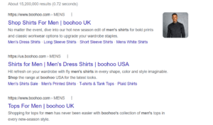
In the need and search part of the customer journey, we found out that Boohoo provided better results for almost all the sections along with the promoted pages which indicates that they are investing in Google AdWords also for promoting their products and targeting their potential audience.

Figure 1: Google search for ‘buy shirts for men’
On the other hand, we could find the only entry for the next e-commerce website on the front page of Google (figure 2).

Figure 2: Google search for ‘buy shirts for men’
We also found that for any related keywords, boohoo was showing more results on the search engine (figure 1) than next (figure 2). We tested the action further by searching for keywords like ‘buy skirt online’, ‘buy men’s boots’, ‘formal shoes under 200 pounds’, etc, and the same trend was followed every time. This indicates that the online awareness created by boohoo using tools like search engine optimization was much ahead of the next e-commerce website.
To create awareness among the consumers, both Boohoo and Next maBoohoo of digital ads and campaigns. Boohoo has also signed Maura Higgins as a brand ambassador of theirs, while next focusing more on digital influencers and online celebrities (Hyseni, 2015). The marketing tactics of Boohoo are not restricted to the internet world as they also create awareness and promote their products using TV commercials and offline events like fashion shows (Benmedjdoub, 2020).
The landing page of the two e-commerce websites is different in many ways. The first message you get on the website of Boohoo is regarding the offers and current sales going on. According to (Todor, 2016), messages like promotional coupons, 80% off, limited period offers, shop new, etc. help in increasing the call to action and enhancing quick purchasing decisions.

Figure 3: Landing page of https://www.boohoo.com/ on 7 Nov 2021
On the next website, the message was to make a purchase now if you want to receive the orders before Christmas. Also, there was no mention of discounts or any promotional offers that were going on (figure 4).

Figure 4: Landing page of https://www.next.co.uk/ on 8 Nov 2021
Apart from the landing pages, there was a contrasting difference in the product discovery pages. For example, on Boohoo, the e-commerce user interface design allowed it to use the full width of the screen and show five results in a row which were very clear (figure 5).

Figure 5: Search result for ‘Christmas party dresses’ on Boohoo
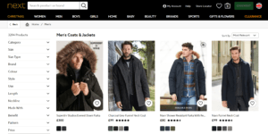
However, on the next website, only four results were visible in a row, and even it appeared a little congested (figure 6).

Figure 6: Search results for ‘men’s coats and jackets’ on next
The good part of the next website was that it also showcased the user ratings on the product discovery pages which helped users evaluate the various products on an eCommerce website (Flanagin, 2011). This was something missing from the Boohoo eCommerce site.
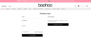
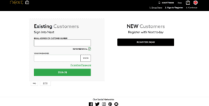
In the purchase section, the most contrasting difference between the two e-commerce websites was how they allowed checkout. Boohoo’s checkout page was allowed to continue as a guest while on the next, there was no such option (figure 7,8).

Figure 7: Boohoo checkout page

Figure 8: next checkout page
User interface plays a very important role on the eCommerce website in building trust, mood, and purchasing decisions (Wong, 2014). The user interface and experience design of boohoo was more attractive and user-friendly overall in comparison to the next. (Merritt, 2020) describes the user interface of boohoo as one of the most user-friendly. Boohoo is designed as per the needs of the customer.
Another major difference that exists between the two e-commerce sitBoohoo the modes of payment. While boohoo was offering so many different ways to pay including PayPal, Apple pay, Klarna, Clearpay, Laypay, Zip, etc., the options for payments were limited to Boohoo cards, credit cards, bank transfers, and PayPal on next.
The final stage Payour investigation was to check for the post-purchase processes. After you place an order, both websites will send you a notification describing the confirmation of the purchase. On boohoo, you can log in and track your order anytime you want. While on next, you only get an estimated date and no tracking information on the website. There is a Boohooact number provided on the next website for customer services (paid service) on which the buyer can make a call to know about the status of their order. Paying extra after placing the order for secondary services like shipping, order tracking, cancellation, refund, etc. reduces the user experience of the visitors on the eCommerce website (Ritonummi, 2020).
Boohoo also sends regular emails to the customers who have opted for their newsletters. Whenever a user creates an account, they are given the option of whether they want to be a part of the newsletter community or not. Next also the user’s permission for sending the newsletters, however, they do not actively participate in email marketing to retarget their previous customers with new products and offers. (Følstad, 2018) states that email marketing is one of the most effective ways for eCommerce websites to convert their previous customers into new purchases.
The biggest limitation of these findings is that it is based on a limited set of products and categories. Also, the design and user interface are something that depends on the liking of the individual. The decisions can be made based on the census but it does not mean that it will satisfy all the consumers. There can be several users who like shopping from a particular website for several reasons including trust, brand loyalty, social awareness, and more. These factors are outside the scope of the eCommerce website and thus can be effectively managed and improved by the management but not through the website.
Proposed New e-Business
The name of the proposed new e-business is ‘Pumky’ because the target audience is mostly youth and middle-aged people. A short catchy name is easy to remember and will help in creating brand awareness. The proposed eCommerce website will make use of SEO and Google AdWords to promote the products under different categories directly to users. It will make use of third-party advertisement options like marketing on a blog which attracts a high volume of users from your target group. This can be easily done using the PPC option and will thus help in bringing useful traffic to the website. Apart from the digital tools, the eCommerce platform should also engage in outside brand awareness activities like participating in events, social causes, etc. This will help in building a positive image of the brand.
The eCommerce website will have a modern design inspired by the Boohoo website which will be easy to navigate, scroll, search, and compare. One feature of next which is ratings of the products on the product discovery page itself should be incorporated in the proposed e-commerce also as it makes the life of shoppers easy. For the purchase section, the proposed e-commerce should allow fast guest checkouts also but only in the case where full payment is already made. This will make sure that users are not misusing the policy and will help with easy checkouts. ECommerce should allow multiple ways for collecting the payments like boohoo because more payment options help in building trust and enhancing purchasing decisions of online shoppers (Lissitsa, 2016). The website should participateBoohoowith reputed delivery partners so that customer experience is enhanced as far as possible. (Tarhini, 2018) says that 7/10 consumers don’t buy from the same shopping website twice if the customer experience has been poor on the first attempt. Thus, the proposed e-commerce website should work on providing the best possible customer service with limited resources.
For the post-purchase section, eCommerce should make use of automated emails to confirm the order to the customers. It should also make use of ‘live tracking’ of orders like in Boohoo so that users can always check the status of their order on their own. The e-business can also set up an IRS call service to help customers who want to know the status of their order through telephonic calls. To save funds, the call center can be outsourced to another like India with a large English-speaking population (Goyal, 2018). The saved email addresses of customers who opted for newsletters can be regularly sent emails regarding various offers and promotions. Too many emails can annoy the users and may lead to massive unsubscribing. Thus, the frequency of the marketing should also be analyzed and controlled by doing proper studies. For example, only one email in three weeks for normal buyers and one email every 10 days for frequent buyers. The newsletter subscribers can also be provided with customized discount coupons and codes every time they purchase so that they are more likely to place an order from the same eCommerce store next time. This process of rewarding the users for making a purchase will help in building brand loyalty. These processes can help in effectively increasing customer retention.
Conclusion
A critical evaluation of the two eCommerce websites has been made by strategically analyzing the different processes of the customer journey. The effectiveness of the two websites varied according to the processes, however, boohoo is the winner in providing a better customer journey and more satisfaction to its consumers. The proposed e-business is also mostly relatable to Boohoo and it has added some new features that make it even superior. If Boohoo can work on the few inputs, then it can considerably make a big difference in providing a much better customer journey and experience to its customers.
References
Mangiaracina, R. and Brugnoli, G., 2008. The e-commerce customer journey: a model to assess and compare the user experience of the e-commerce websites. The Journal of Internet Banking and Commerce, 14(3), pp.1-11.
Carpineto, C. and Romano, G., 2017, August. Learning to detect and measure fake e-commerce websites in search engine results. In Proceedings of the International Conference on Web Intelligence (pp. 403-410).
Hyseni, H., Brown, C. and Gannon, M., 2015, July. Shopping and socializing: online journey to product evaluation and purchase in fashion retail. In ECSM2015-Proceedings of the 2nd European Conference on Social Media 2015: ECSM 2015, Academic Conferences (p. 207).
Benmedjdoub, A., 2020. Eyes on the ball. Ragtrader, (May/Jun 2020), pp.11-12.
Todor, R.D., 2016. Blending traditional and digital marketing. Bulletin of the Transilvania University of Brasov. Economic Sciences. Series V, 9(1), p.51.
Flanagin, A.J., Metzger, M.J., Pure, R. and Markov, A., 2011, January. User-generated ratings and the evaluation of credibility and product quality in e-commerce transactions. In 2011 44th Hawaii International Conference on System Sciences (pp. 1-10). IEEE.
Wong, W., Bartels, M. and Chrobot, N., 2014, June. Practical eye tracking of the e-commerce website user experience. In International Conference on Universal Access in Human-Computer Interaction (pp. 109-118). Springer, Cham.
Merritt, K. and Zhao, S., 2020. An Investigation of What Factors Determine How Customer Satisfaction Is Increased through Omni-Channel Marketing in Retail. Administrative Sciences, 10(4), p.85.
Ritonummi, S., 2020. User experience on an e-commerce website: a case study.
Følstad, A. and Kvale, K., 2018. Customer journeys: a systematic literature review. Journal of Service Theory and Practice.
Lissitsa, S. and Kol, O., 2016. Generation X vs. Generation Y–A decade of online shopping. Journal of Retailing and Consumer Services, 31, pp.304-312.
Tarhini, A., Alalwan, A.A., Al-Qirim, N. and Algharabat, R., 2018. An analysis of the factors influencing the adoption of online shopping. International Journal of Technology Diffusion (IJTD), 9(3), pp.68-87.
Goyal, P., 2018. Call Centers: An Opportunity for Job Startups. Multidisciplinary Higher Education, Research, Dynamics & Concepts: Opportunities & Challenges For Sustainable Development (ISBN 978-93-87662-12-4), 1(1), pp.168-174.

